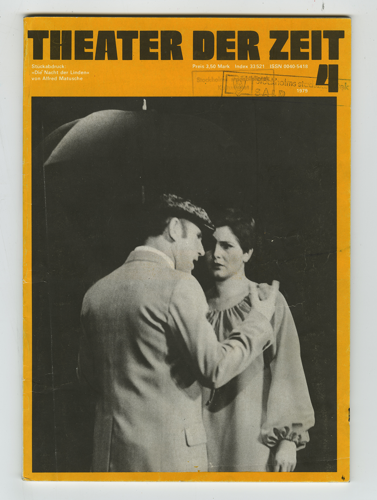
Reidar Pritzel
ContactOne of the inspirations to the typeface Tobo Bold comes from Wayne Stettlers Neil Bold from 1966. Found on the this cover of Theater Der Zeit from 1979.
2019.04.10
23:01
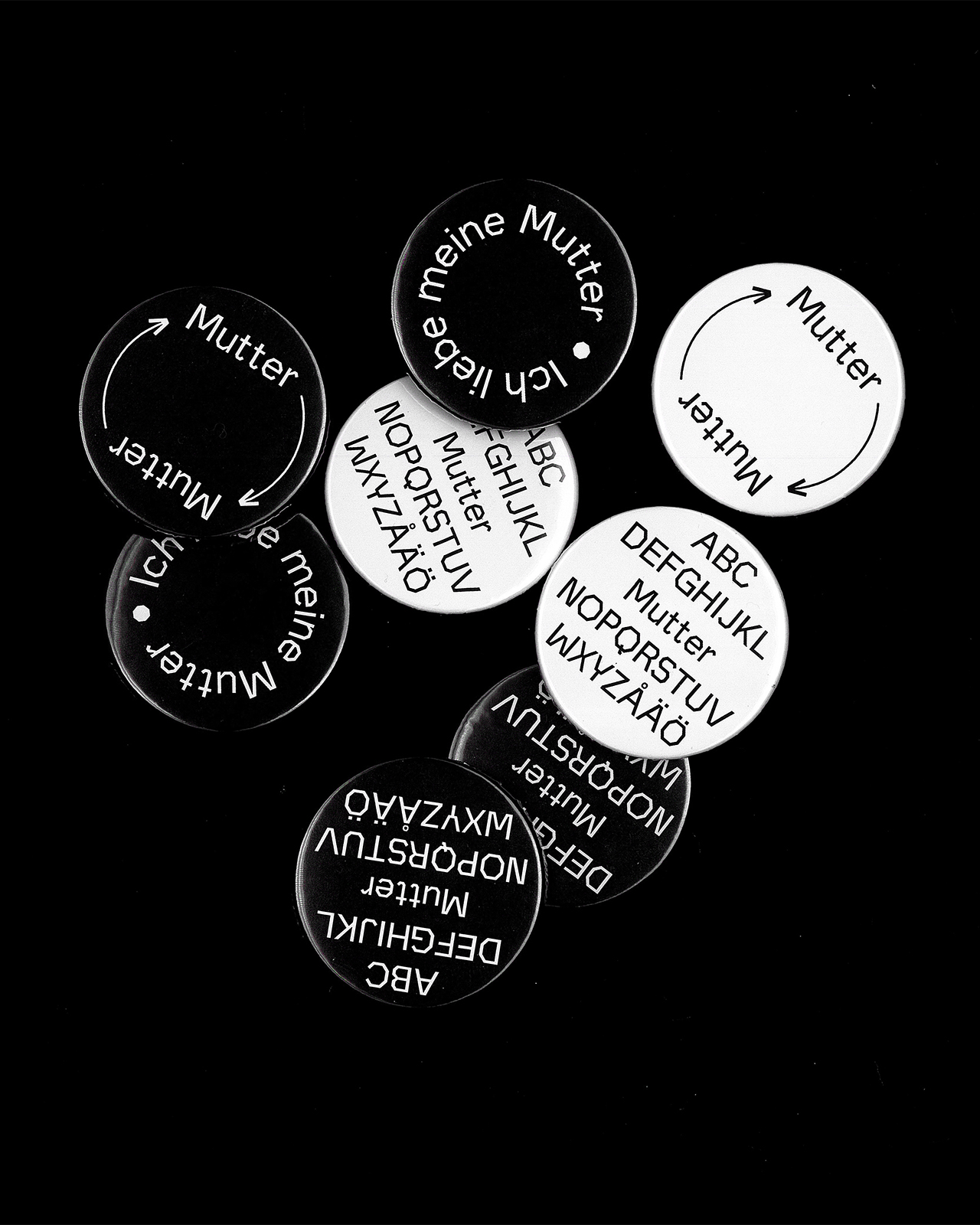
Tilda Ragnartz
ContactA typeface I made during a summer course in type design with the purpose to pay the rent (and secondary to learn Glyphs). The typeface is based on a hand-drawn a, and is still incomplete.
2019.04.11
15:39
.gif)
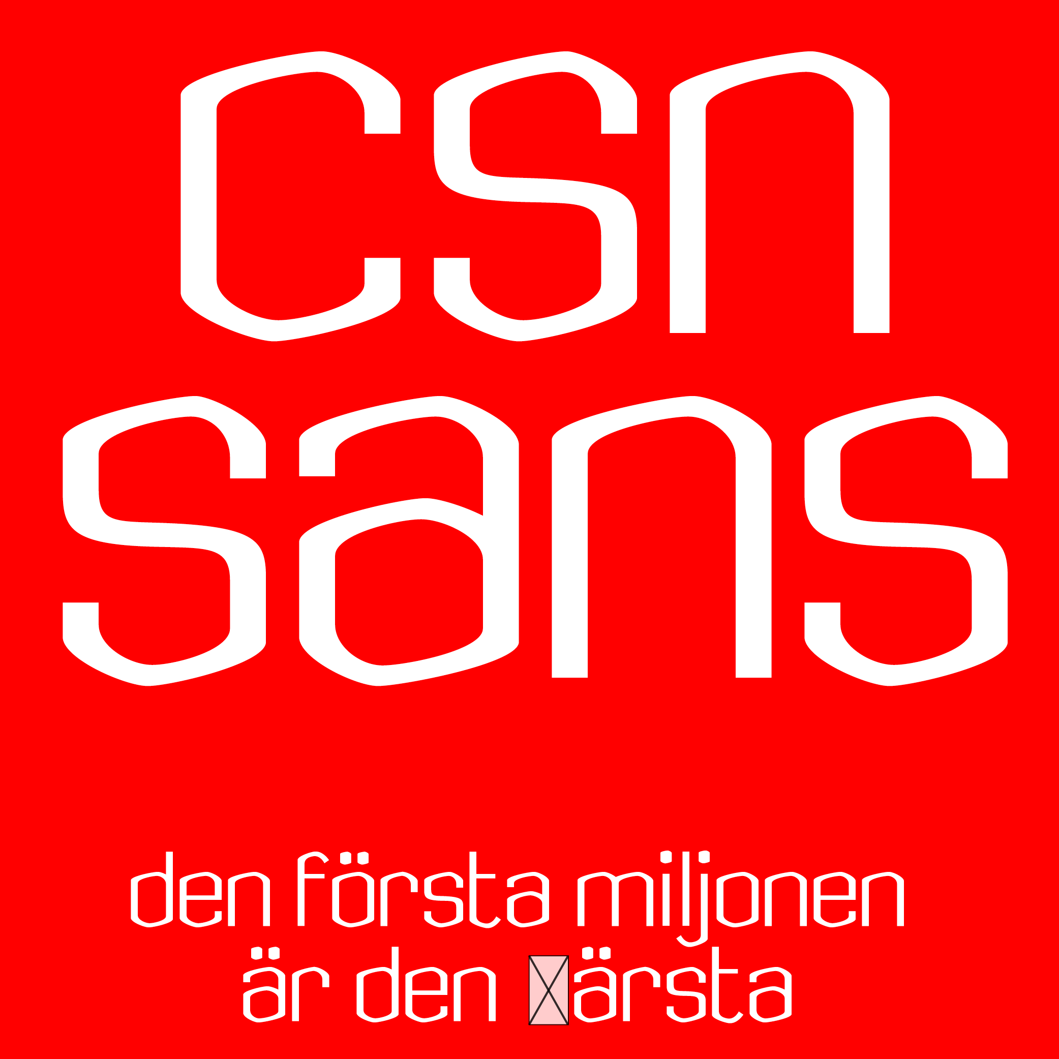
Louise Silfversparre
ContactSerpentin Sans is a typeface in progress. Serpentin in Swedish means party streamer, which is the inspiration for the movement and shapes of the letters.
2019.04.14
13:11
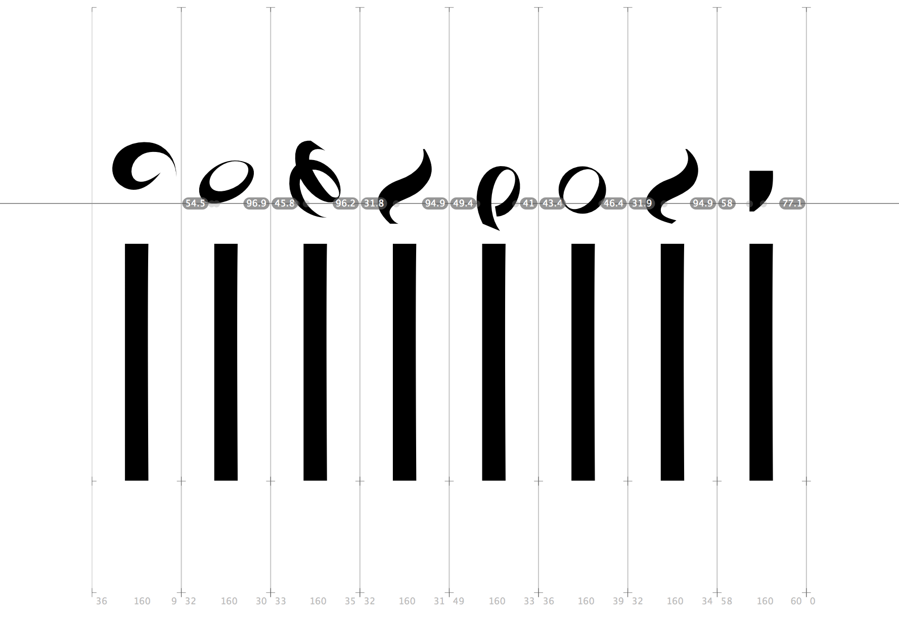
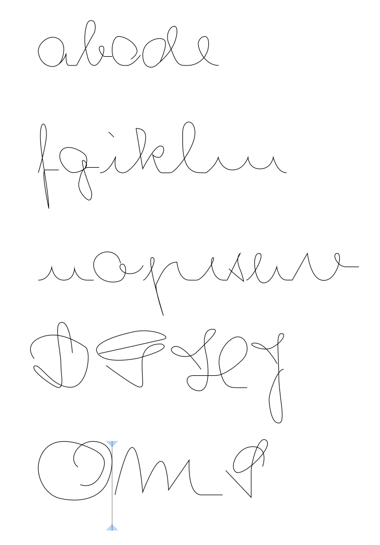
Lisa Åsberg
ContactA script font I have just started working on, based on my great grandmothers handwriting from the 1930s.
2019.04.25
16:57
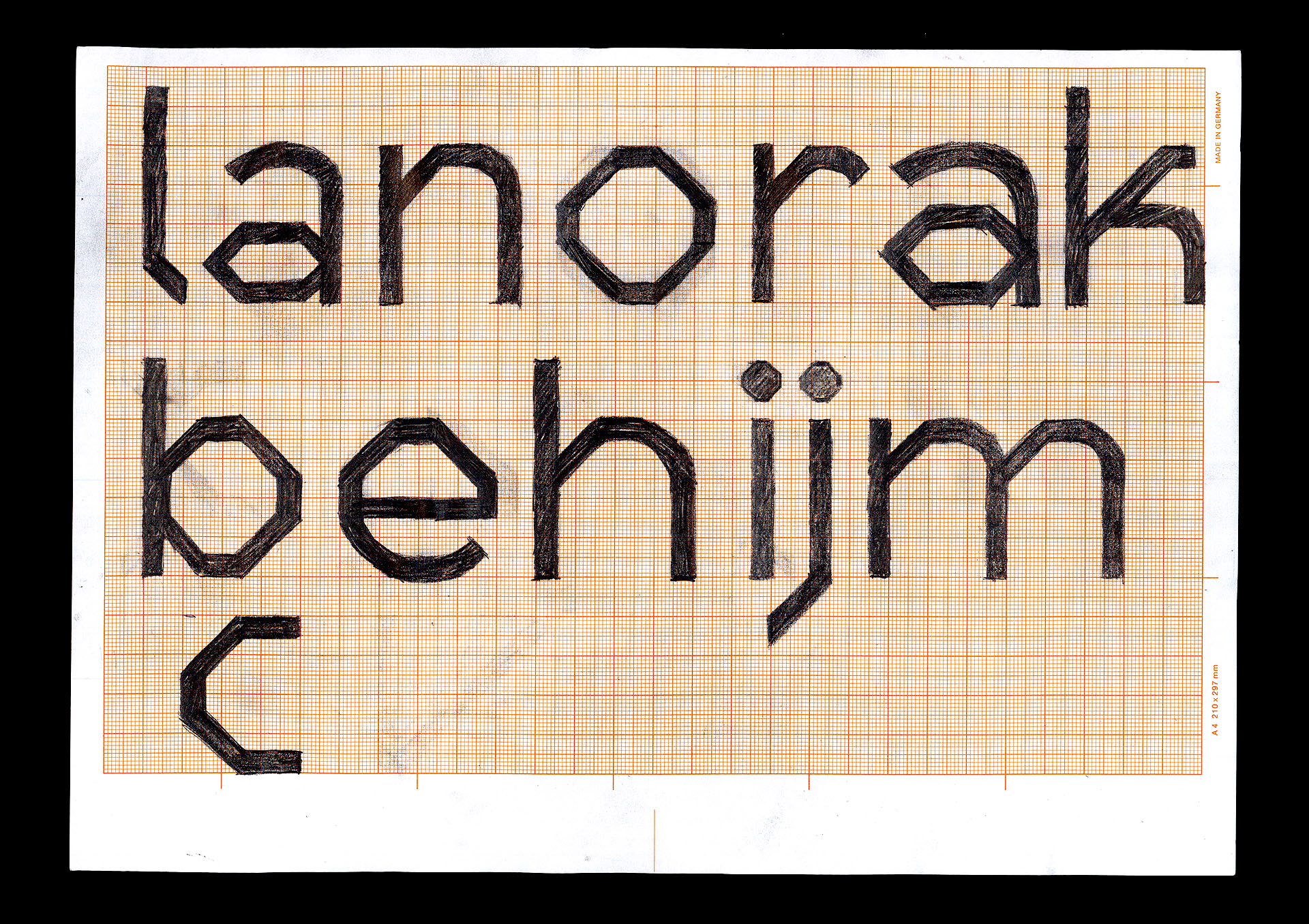
Gabriel Fager Ferrari
ContactFirst steps on a new type design project. I’m exploring the relationship between the rounded and the sharp, without losing readability or character.
2019.05.01
10:34
Felix Scheynius
ContactInspired by the linking of heavy chains, Vince typeface aims to be hard and soft at the same time. Plastic Vinyl on mirror – scanned.
2019.04.10
23:01
Viktor Nilsson
ContactThis is a sketch of my font No Harmony. The letters are wobbly, naive and playful.
2019.04.09
20:30
Lova Nyblom
ContactInspired by parallel universes I’m finishing up a title font called “parallelogram” based on the shape of a parallelogram.
2019.04.10
17:46


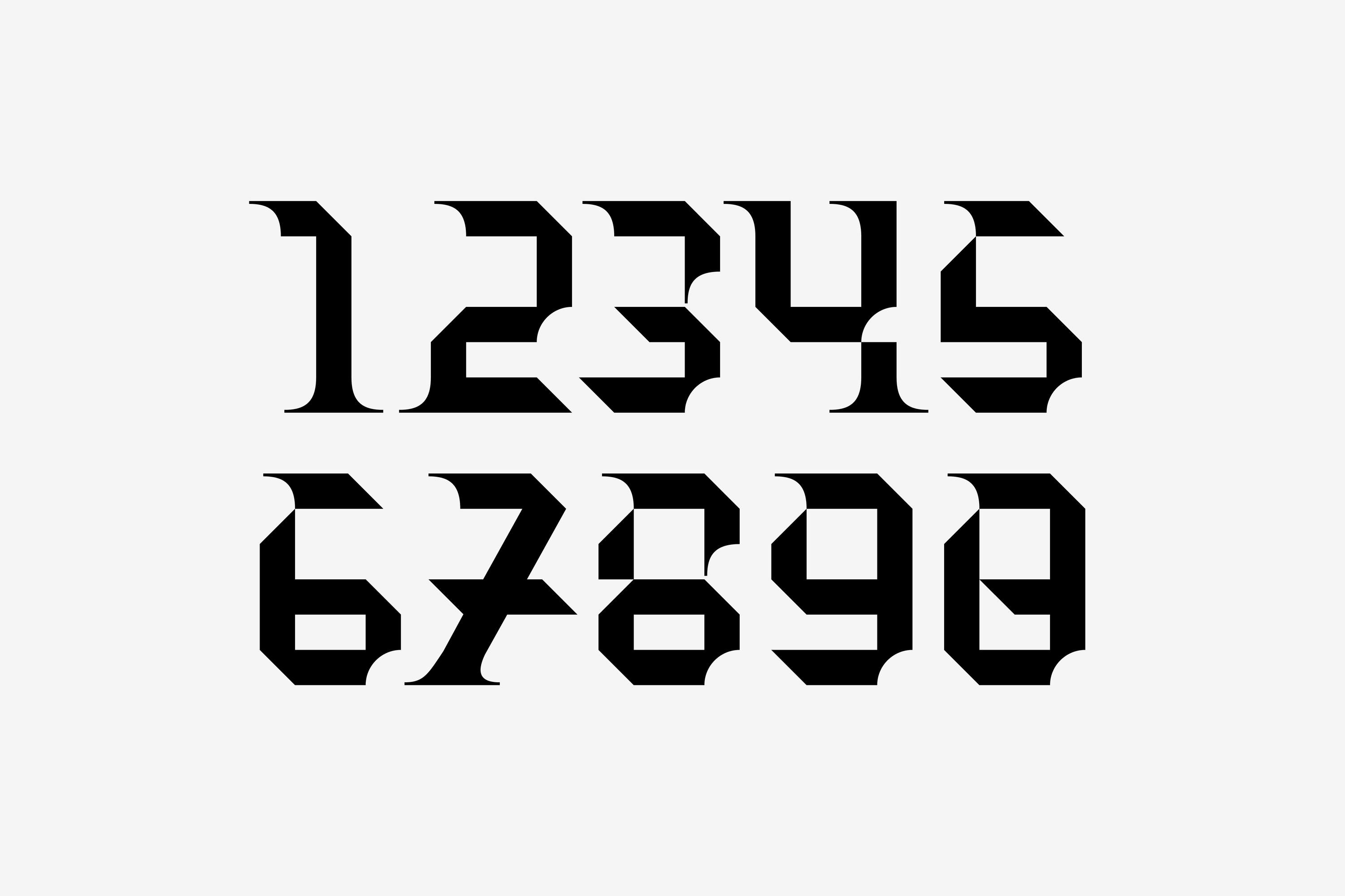
Gabriel Fager Ferrari
ContactJust finished the final touches of the numbers in Ruta Sans.
2019.04.12
19:07

John Bengtsson
ContactEarly use of Extra, a WIP typeface inspired by old political posters and newspaper headlines.
2019.05.11
18:41

Viktor Nilsson
ContactThis is the work in progress of the typeface GORBA. A font inspired of 90's, Russia and cyberspace.
2019.05.18
14:54
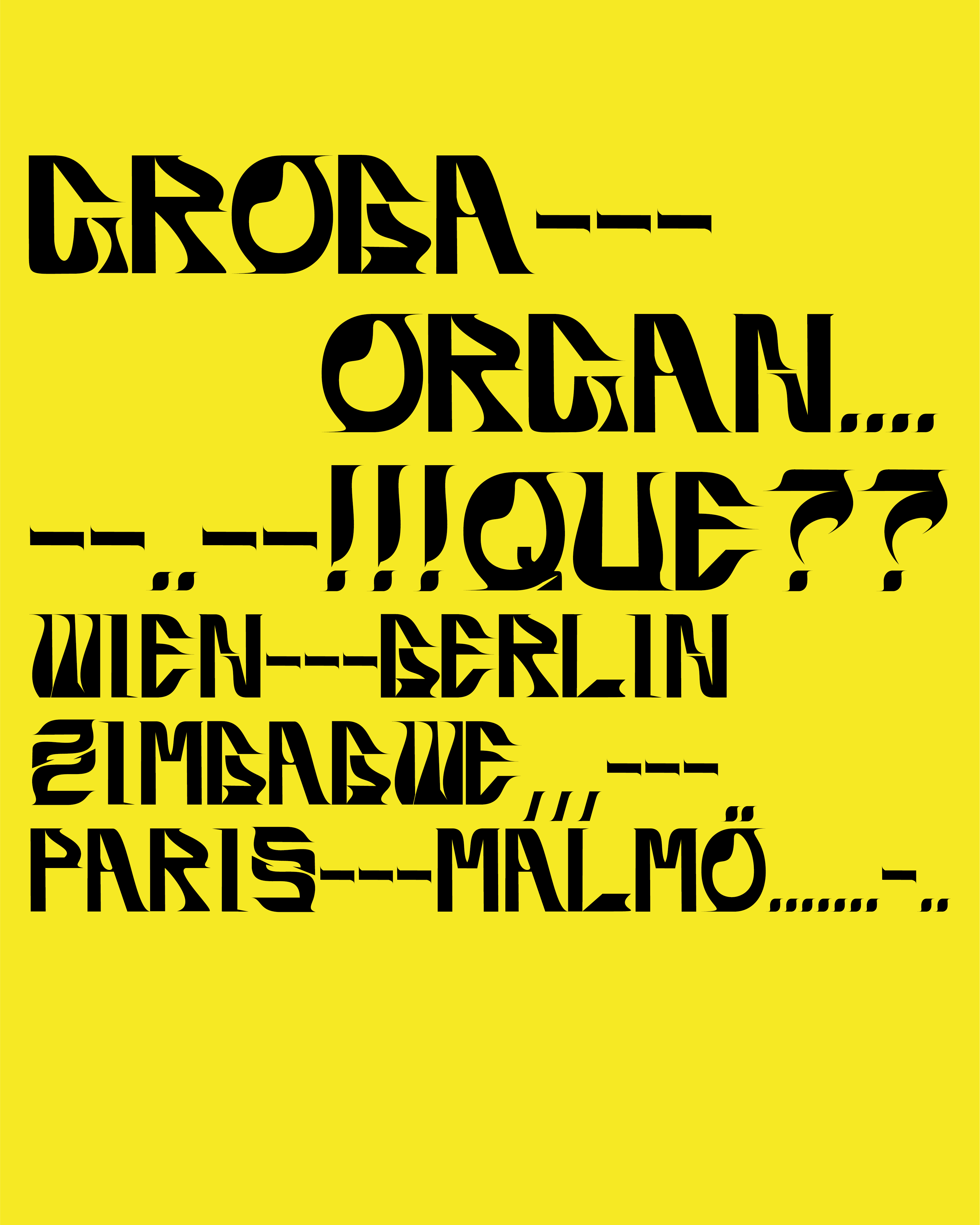
Viktor Nilsson
ContactThis is the work in progress of the typeface GORBA. A font inspired of 90's, Russia and cyberspace.
2019.05.18
14:56

Gabriel Fager Ferrari
ContactWork in progress! This is one of the first digital sketches on a new typeface I’m currently working on.
2019.05.17
12:16